What is branding?
Branding is the process of creating a distinct identity for a business in the mind of your target audience and consumers
Branding involves developing and implementing a number of identifiable features to your business so your consumers can associate themselves with your business. Branding increases the recognisability of products and services amongst your consumers, giving you that competitive edge within the market.
1. Typography
Brand typography is a visual component of a brand’s style guide or book that organises and aligns your company’s written copy with your brand’s personality. While they are all closely related, brand typography differs from font or typeface. So, let us introduce you to the types of branding fonts and understand their distinctive personalities:
- Typography is the set of characteristics that enhance a company’s design, brand voice, and personality across both digital and traditional channels
- A typeface is a designation given to a group of similar fonts
- Fonts are the components that make up a typeface, such as weights, widths, and styles
Serif Fonts
These are the oldest types of fonts, featuring little feet at the tops and bottoms of each letter that are referred to as serifs. These tiny flourishes came from painters’ brushes and were used as decorative accents on the letters.
Personality: Serif typefaces are popular among businesses that want to project a beautiful, sophisticated image. These types of logos exude tradition, dignity, and dependability.

Sans Serif Fonts
The clean, straight lines of the Sans Serif fonts define them. They lack embellishments and stress legibility and simplicity for a more scalable appearance.
Personality: These fonts have a simple, no-nonsense appearance. They stress clarity with a forward-thinking attitude, yet because of their polished and efficient design, they can also be bold and employed as attention-getters.

Slab Serif Fonts
These fonts are known for their solid and bold approach and are more popular with modern brands than classical ones. They can be either rounded or angular, with some closely resembling typewriter styles.
Personality: These fonts create a loud, bold image. They showcase a sense of confidence, reliability, and creative thought owing to their heavy lines and less delicate serifs.

Script Fonts
The flourishes were significantly reduced in casual script styles. These typefaces likewise forego the blocky print appearance in favour of a more natural-looking cursive form. These scripts are intended to mimic handwritten calligraphy.
Personality: Script fonts, in general, create feelings of elegance, inventiveness, independence, and femininity. Their curved and flourishing forms imply a more hands-on, intimate approach to business and are ideal for conveying a sense of unique and artistic thought.

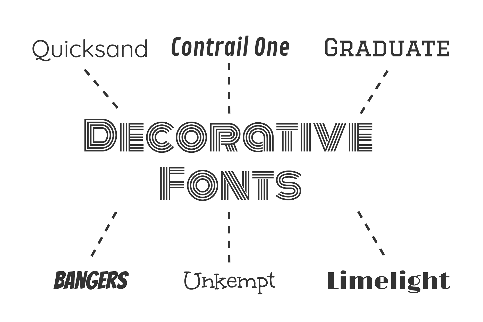
Decorative Fonts
These fonts forego conventions in favour of a distinct and beautiful typeface. Because they are often adapted to individual firms, most ornamental types are effective for a wide range of sectors and demands.
Personality: These fonts, in general, convey individuality and accentuate originality. A sensation of casual, fun, and creative thought are some of the most prevalent emotions generated. They can also elicit culturally unique memes, as well as qualities or themes reminiscent of a given time period. They are among the best typography for logos.
Importance of Brand Typography
When we dive into brand typography, understanding the basics is essential. Let us know how a brand’s personality is conveyed through type.
People view your brand through words in a variety of settings. It is an experience for a customer to see a message on your television advertisement, view your internet page, or look at your product’s name. Delivering an outstanding customer experience through your products or services is crucial to a strong brand image.
You must remember that a good design does good business. If you are serious about your company’s branding and the visual image it is portraying to your brand’s audience, you should invest in a professional brand identity designer, as professional logo designers and hand lettering typeface designers understand the importance of brand typography for your Brand’s design. They have a thorough awareness of how it aids in interpreting the meaning of a brand and follow specific typography brand guidelines.
Brand Typography Conveys Meaning
As clothing fads vary, so does typography. Thus, the choice of typefaces should never be influenced by what is trendy in the design industry. Whatever typeface you select should be meaningful and creative.
Brand Typography Changes Perceptions
The typographic effects have a significant impact on consumer perception. With enhanced technology, how people connect with social media has radically changed, implying that a rising amount of content is consumed through screens and adaptable technologies.
Brand Typography Sets the Mood
Users may be drawn in by the image, but it is crucial to remember that typefaces have both direct and indirect effects on people, so they should be acceptable in order to represent the true essence of a business. The choice of typeface has a hidden meaning that plays a significant impact. A font can evoke emotion, improve theme, pique attention, associate personality, and even convey trust, all of which are crucial to the successful launch of a project.
Choosing right color for your Brand

From the yellow helmet of a construction worker to a bride’s pristine gown, colors are quick to convey important information. Their strong and immediate impact make color palettes a crucial component of any business’s branding efforts.
The color scheme you’ll assemble for your brand will play a key role across your various marketing assets - from the way you create a logo and design a business card, to the design of your website, and much more. Employing brand colors consistently and across all platforms can result in a unified look-and-feel to your company, making them memorable and recognizable.
To help your business stand out with the right brand colors, this complete guide covers everything from what brand colors are all about, to a step-by-step process for choosing your own. We’ve also selected and analyzed 10 examples of successful brand colors for your inspiration:
How to choose your brand colors
What are brand colors?
Brand colors are a palette of around five to ten colors that are used to represent a certain company. A consistent and strategic application of brand colors can increase brand awareness and recognizability.
Some of the main applications of brand colors include: a company’s logo, website color scheme, social media channels, business card design, and print and digital ads. For businesses operating as brick-and-mortar, the brand colors can also apply to the design of the store, staff uniforms, product packaging, and more.

01. Establish your brand identity
The colors of your brand are a reflection of your brand identity. Your color palette should therefore align with your values and the messaging that you wish to communicate.
For this purpose, you’ll need to first define your brand identity. A recommended practice for this is to compose a list of adjectives that describe your company’s character, as if you were talking about a person. Ask yourself how you’d like the brand to be perceived, and what sets it apart from the competition.
The following spectrum of brand identity traits is key for building a brand, and can help you pinpoint the core of your brand more easily:

02. Explore color meanings
Now that you’ve identified your brand personality, it’s time to choose the colors to make it shine through. In doing so, it’s worth looking into color psychology principles for common color meanings.
However, it’s also important to mention that color is not an exact science, and there’s no equation to accurately define which color means what. This is where color combinations come in, as they help in achieving a look that evokes certain feelings through their juxtaposition.
To understand this, think of the difference in the meaning of the color blue when it’s paired with gold - conjuring notions of royalty and luxury - as opposed to the same blue, but paired with pink - which tends to feel much more playful.
Colors can mean different things depending on the colors they’re paired with, as well as on context and cultural connotations. There are, however, clear trends in color use based on industry. To help you choose the right color palette for your business, here’s a quick breakdown of popular brand colors by a few main industries:
Food: Many food and restaurant businesses opt for warm colors that draw attention and evoke appetite, such as red, orange and yellow. Other food brands choose green to promote connection with nutrition and wellbeing, or blue and pink for sweets and deserts.

Health and wellness: Most health and wellness companies choose blue to signify cleanliness, trustworthiness and responsibility. Other popular options are green, representing nature and wholesomeness, and orange, which can bring up ideas of vitality and energy.

Fashion and beauty: The fashion and beauty industries often use black for sophistication and glamour, and warm colors such as red, orange and pink for passion, confidence and excitement.

High-tech: Tech companies most commonly go for blue, which symbolizes trust, intelligence, and efficiency. Additional colors are orange, which is friendly and optimistic, and purple, which stands for quality and creativity.

03. Search for inspiration
As a final step before crafting your brand colors, look around for color inspiration. Browse through your competitors’ palettes, and try and understand what it is that makes them work well. Think of what you can learn from their color choices, and of ways in which you can differentiate yourself from the competition.
Other great sources of inspiration are online color palette generators, where you can find ideas for interesting color pairings and mesmerizing shades. You can also explore these logo color ideas for some inspiration.
To get your creative ideas flowing, we’ve gathered 10 successful brand colors and analyzed what it is that we like about them. Scroll down towards the bottom of the article to feast your eyes on some beautiful colors.
04. Pick your primary color
Your brand’s primary color, or core color, is the one most associated with your brand. Think of the signature Tiffany’s Blue or Pinterest’s red.
For your primary color, look for a single color that best embodies your business based on color meanings. You can experiment with different shades and tints of the color you have in mind, going from lush and dark to soft and pastel, or even bright neon, in order to find the perfect look.
05. Choose your secondary colors
Once you have your primary color, pick two to four colors to go along with it. These colors will compliment your primary one, and can either appear next to it or independently. A brand’s secondary colors can go in a few different directions:
Analogous color scheme: These are close variants of your primary color. This means that if your primary color is bright red, you can add other warm colors (such as orange and yellow) that belong to the same color family. Analogous color schemes are usually harmonious and pleasant in their appearance.
Monochromatic color scheme: These are different shades and tints of your primary color. For example, if your primary color is blue, your secondary colors can be light blue and dark blue. Monochromatic color schemes can strengthen and enhance your core color.
Contrasting color schemes: Contrasting colors are either complementary colors (seated across from each other on the color wheel), or a selection of colorful, equally-vibrant hues. This color scheme can help your brand colors pop and usually gives off a fun and modern feel.

06. Select neutral colors
When crafting your brand colors, it’s easy to focus on the main colors and overlook the neutrals. However, neutral colors are important as they are the ones in charge of most of your communication (such as the color of your written text) and will appear in the background of most of your assets.
Neutral colors are usually white or black, often combined with a few shades of gray.
07. Test your brand colors
Once you’ve picked your colors, place them all together and test them in a few different combinations to make sure they complement one another, and convey the message you were aiming for.
In order to make your website accessible, you should also test your palette for in order to make sure that they’re clearly legible together. There are plenty of online resources and browser plugins that test color contrast for accessibility. Contrast Checker and Colour Contrast Analyser are two such tools that we recommend.
10 inspirational brand colors that work
1. Starbucks
Starbucks’ brand colors are based on a family of greens, combined with four neutral colors. Their primary color is that of the Siren logo - an iconic shade referred to as “Starbucks Green.”
The expanded color palette merges this primary green, alluding to the brand’s rich heritage, with other “fresh and inviting” hues. These include an accent green and two secondary greens.

2. Instagram
The Instagram brand colors are a gradient of blue to yellow, with a wide range of purples, pinks and oranges in between. This gradient is a reinterpretation of the brand’s rainbow from its earlier, skeuomorphic logo.
This rich color spectrum is meant to evoke feelings of “warmth and energy.” It’s also a tribute to the importance of color in the app’s filters, community uploads, and more.

3. Slack
Slack’s color palette is just as refined as it is playful. It features four primary colors - white, black and two shades of aubergine purple. Accompanying those are blue, green, yellow and red, serving as accent colors.
In Slack’s case, it’s the accent colors that take center stage in the logo, and not its primary aubergine. Coming together to form an octothorpe, the four colors bring to mind notions of teamwork and collaboration.

04. The Guardian
The Guardian is most associated with its navy blue and bright yellow shades. Yet for a platform this rich in content, colors take part in more than brandability alone. They also serve as a navigational tool, by distinguishing between types of editorial content.
For example, red marks news articles, orange is for opinion pieces, and brown is for cultural topics. Each of these colors comes in a selection of variants, depending on their application: dark, main, pastel and faded. These allow for flexibility in color use.

05. Google
Google has one of those timeless logo designs that we all know by heart. And just like the design itself, the four colors of the logo (blue, red, yellow and green) are equally synonymous with the company. Those are the brand’s primary colors, along with white which is also predominant in Google interfaces.
The secondary Google colors are darker versions of the primary ones. Those are followed by tertiary light blue and light green, and a range of grays that serve as the neutral colors in delivering information, such as in written text.

06. Lyft
Lyft is well-known for their signature pink. Yet surprisingly, the primary brand palette is composed of white as the main color, followed by black, and only then - the Lyft Pink. This ratio is meant to instill the pink with greater meaning, making it stand out in the times it is used.
The brand’s secondary palette is much more encompassing, including 40 different colors - from greens and yellows to blues and oranges. These are used to support the main brand colors, and take a back seat in crafting their brand identity.

07. Dell
The Dell brand colors are divided into three tiers. The first tier includes the company’s core colors, with the signature Dell Blue as the primary color, giving off a “vibrant and energetic” feel. The three shades of blue act as the foundation to the rest of the palette.
The second tier is made up of three accent colors (purple, berry, and orange) and five neutrals (white and a range of grays). Last is the third tier, which features three additional accent colors. An exception to this palette is black, which can be used for text or in the logo, but not as a design element.

08. Dropbox
Dropbox’s primary brand colors are blue, black and white. But there’s much more to it, as the main focus here is the versatility of different color combinations. Dropbox boasts 18 brand colors that produce a total of 32 different pairings.
Dropbox’s rich color spectrum is intended to generate unique mixes that go together well, leading to “interesting and often unusual combinations.” This unique visual language is achieved through dynamic, mix-and-match variations, rather than through unification and standardization.
 Image source: Behance
09. Mastercard
The Mastercard logo is composed of two overlapping circles, one red and the other yellow, which together produce a bright shade of orange. This same orange is also the company’s primary color, accompanied by two shades of gray (light and dark) as the background colors.
The secondary colors in the Mastercard color palette are gold, yellow and green, and the accent colors are red and teal.
 Image source: Pentagram
10. Airbnb
There are five Airbnb brand colors. The most prominent among them is pink (called Rausch), which is also the color of the brand’s logo, and is used repeatedly in the company's website design. The pink is joined by a turquoise shade, an orange, and two grays - dark and light.

Choose Best Logo for your branding
- Understand the purpose of your logo.
- Use a color that makes your logo stand out.
- Get familiar with different types of logos.
- Balance your design elements.
- Make your logo versatile.
- Get help from an expert.
1. Understand the purpose of your logo.
Your logo acts as a visual representation of what your company does, and helps existing and potential customers recognize your business.
An effective logo design:
Symbolizes your business values.
Increases credibility in the eyes of potential customers.
Serves as a visual keepsake for customers.
If you’re starting a business, don’t worry what your startup logo looks like just yet. Instead, ask yourself what you want people to feel when they first encounter your company. Consider the words they would use to describe using your products or services. These words are the essence of your business.
Then, you can associate those words or feelings with a look and feel. Think of this initial brainstorm as the foundation you’ll build your logo around. It’s important to create a list of business attributes to give you a clear communication goal.
Let’s use a spa as an example. You go to a spa to relax and rejuvenate. These associations need to come through visually so that people get a sense of how they’ll feel relaxing at the spa just by looking at your logo. Think of some of the words associated with a spa – maybe even close your eyes and imagine you’re there, kicking back and relaxing. What words best sum up your daydream: Calmness? Tranquility? Peace?

Clean and simple design elements and text treatments would best represent those attributes. The lotus flower is a popular symbol for spas for its cultural associations with purity, beauty and rebirth. It could be coupled with a simple serif font to convey that sense of calm.
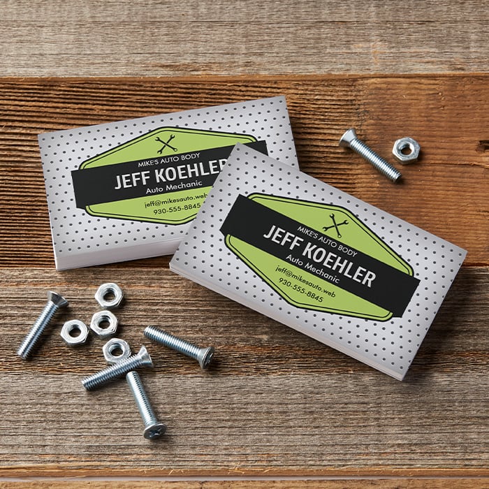
On the other hand, if you’re a mechanic , you might want to communicate that you’re practical, hardworking and reliable. How would you visualize these qualities? You might opt for something vintage and rustic that includes the tools of your trade, like a wrench or an oil can. These visual clues both communicate that you’re not afraid to get your hands dirty fixing cars. They’re also easy to recognize and associate with a service.
2. Use a color that makes your logo stand out.
The subject of typical emotional associations with colors is fascinating, especially seeing how they differ between cultures. A lot of our customers use black and blue, which is probably due to seeing so many established corporations using these colors – and for good reason! Black is often used as an expression of strength, sophistication, tradition and trust. Blue is typically associated with competence, trust, dependability and security.
Go back to the attributes you’ve noted down and think about how you want your customers to feel when they see your logo. Think about what you want your logo to say and how color associations will affect your message. Then, consider the type of logo that best suits your business.
If you describe your style as bold and colorful, those attributes should come across in your logo. If your business style is more mellow and understated, you can use more subtle shades. Look at other businesses with a similar style to get a feel for what works. What colors do they employ to communicate those attributes?
3. Get familiar with different types of logos.
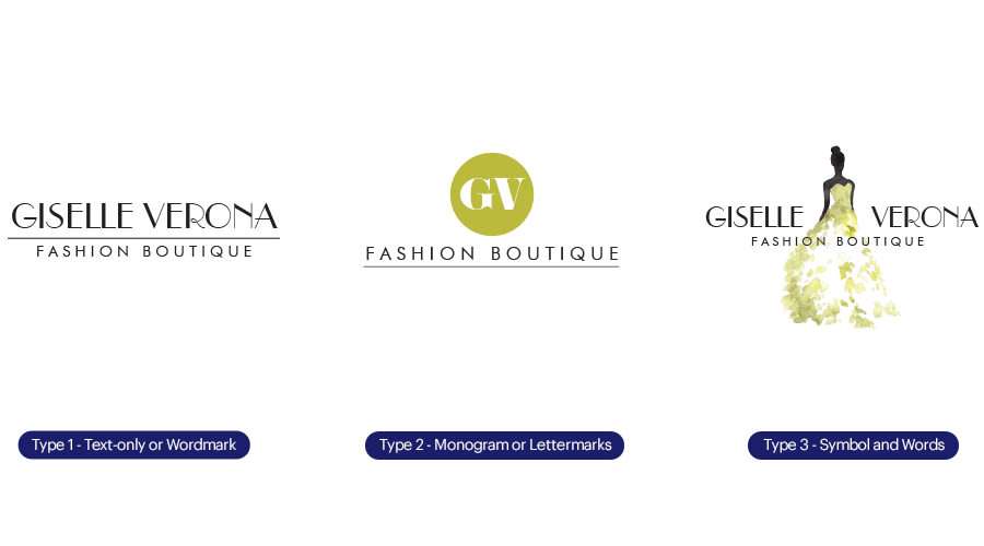
There are three basic types of logos – check them all out and decide which one is best for your business.
- The first is a text-only or wordmark identity, which is ideal if your business has an established reputation or uses a family name.
- The second type of logo consists of a monogram or lettermark, which uses the first letters of the company name in a visual way. This combination provides both a visual representation of your company and a verbal recognition of your name.
- The third logo type combines a symbol with words. The logo is often made up of a shape that acts as a visual clue to the service or product you offer. This serves as the central part of your logo, which when coupled with a company name creates a recognizable and enduring look.
4. Balance your design elements.
Once you have figured out the essence of your business, you need to start thinking about how to balance that vibe to the style of your logo. “For example,” Megan says, “if your company is quirky and fun, you can try fresh, unique fonts paired with dynamic colors and symbols. Or, if your company is more traditional, you could balance your logo by using a classic font and more conventional color palette.”
And like so many things in life, Megan recommends that, when in doubt, keep things simple. “Clean, open spaces will instantly make your logo look professional…and ensure it’s easy to recognize.”
One of Meghan’s favorite perfectly-balanced logos is the World Wildlife Fund logo. “It’s recognizable and has been around for ages, but doesn’t feel outdated at all. It’s one of those classic logos we all recognize. I love the smart way the white space wraps around the panda to convey a sense of protection.”
Another of her favorites is Bully Boy Distillers. “It’s a Boston liquor company with a fascinating family story. What I like about their logo is that it’s also bold and recognizable—just like their name. It’s one color and employs an imposing horse icon. Their labels couple elegant typography with a solid silhouette to achieve an established look, despite the brand being relatively new. This example demonstrates how the right font selection can elevate an icon.”
5. Make your logo versatile.
Knowing where people see and interact with your logo is crucially important. If you own a coffee shop, you probably want your logo to go on your T-shirts as well as the menus, flyers, website and your social profiles. It’s also likely to be included on your signage, so it needs to work in a variety of sizes.
If you work onsite as a landscaper, plumber or building contractor, you may want to advertise when you’re on the go—maybe by adding your logo to the side of your vehicle with a car door magnet or vinyl decal. So, make sure all text is clear and easy to read, even from a distance! Be sure to test the legibility of your logo from various distances.
6. Get help from an expert.
If you don’t feel confident designing your own logo and have a limited marketing budget, you’re not alone. The good news is, there are several options available to help you design your logo.
If you just need something simple that communicates your area of business and contact details, browse the designs in our galleries. There are thousands of business card designs to choose from covering most sectors and styles with a range of matching products. The logos you see in the business card gallery can feature across your complete marketing toolkit.
If you want something unique or more customized or bespoke, check out our logo design services page. There, you’ll find 3 different ways to get a logo, including our free logo design tool, Or, you can find a 99designs designer to work one-on-one with you.